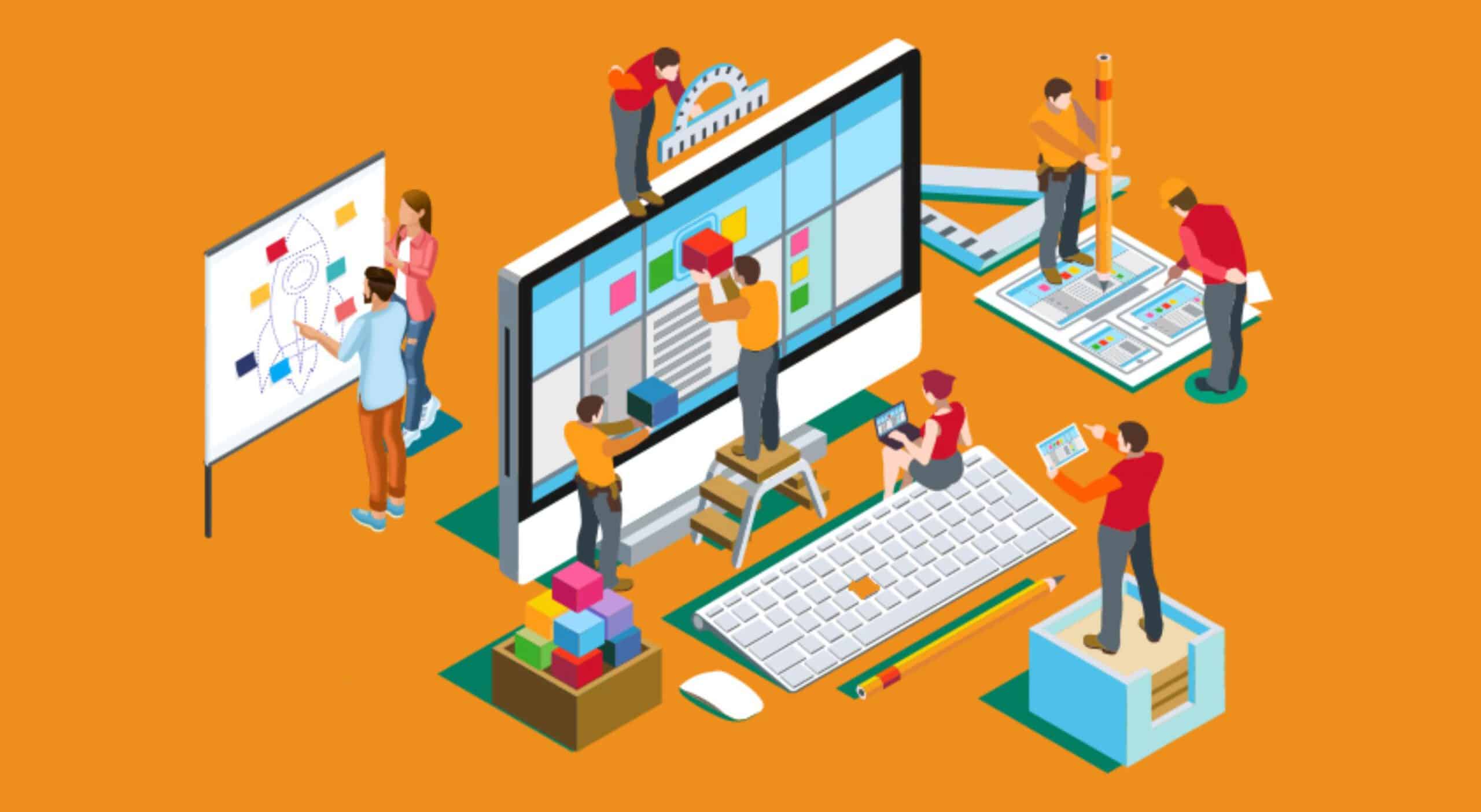
Just like in the world of fashion, trends in the web design arena tend to vary. While a few of them are critical requirements, such as responsive design, others are simply high-tech or industry-led moves such as the development of flat design. It is wise to pick and follow trends that are essential for fulfilling the needs of your visitors or users as well as your business.
The selection should never be based on what other popular sites are implementing. Remember, it takes no time for trends to fade. A site made blindly using other sites’ trends, without analyzing what is required and what is not, can quickly become outdated.
Year 2016 is coming to an end and it’s necessary to analyze, which web design trends might evolve further in 2017 and which new design trends would hit the market. With that in mind, here are the top 5 essential web design trends that you should ideally continue even in 2017 along with several new ones. Alternatively, you could just hire a web design company.
Hamburger Menus

It’s a fact that a hamburger menu is criticizeddespite being popular onseveral web sites. However, it is going to stay for some more time. Why? That is because it’s still recommended for some sites, although it is not for all types of sites.
As the name suggests, the menu hides the global navigation for ensuring a cleaner and sleeker look on smaller screens such as on mobile devices. The plus point is that the users can open the navigation bar only when they wish to see or use it.
However, it is not for the news and e-commerce sites, as it reduces usability. Well, you can go for it if the bounce rate is high for landing pages or if your visitors are clicking it frequently. It is also recommended to combine the hamburger lines and a menu label instead of showing the hamburger icon alone. The best example of this is the Adobe site.
Large Background Media

Whether you choose to have an image or a video for your homepage background, it is surely a better option that a section of text explaining a product or services in a few seconds. Often holding a big header image or video in a major section of a page or on full page, a background media is a great way to tell an impressive story and pass on all emotions and persuasion to the visitors for establishing your brand.
A big background image or video is a recent design trend, which is seen on popular sites such as AirBnB. While these images and videos show up well on different browsers, it’s a good idea to check it through a cross-browser testing tool to see if videos work well on mobiles as some video formats are not supported.
Animations
With the ability to make user experience much engaging and interactive, animations are likely to stay in this arena for long. In fact, there is no probability for it to go away from the web pages. Animations have evolved significantly from animated flat icons to storytelling visuals. Most animations are done using popular GIF images, but the new trends include GIFV and Giphy videos.
Semi-flat Designs

The Window’s Metro style increased the popularity of a flat web design. However, due to some cons including the usability issues, the trend of semi-flat design is catching more popularity. Ensuring ease of usability, this trend combines depth and dimension via transitions and subtle shadows. Definitely keep an eye on how semi-flat design will evolve in 2017. It’s quite possible we’ll revert back to good old 3d looking designs as semi-flat designs still cause some usability issues.
Minimalism

This design trend is the blooming answer to the maximalist design featuring material and flat designs. As the name suggests, minimalism aims to create simple pages and communicate a direct message with dramatic typography, white space, and simple color schemes. With its further evolution in 2017, this strategy is likely to prove robust for targeting specific visitors and establishing awareness of brands.
